
A good visiting card background does one job: it makes your name and number easier to read, not harder. That means a subtle design, printed from a file sized at 300 DPI for the standard 3.5 x 2 inch card, in a colour that suits your trade. Everything else is decoration.
This guide covers the whole decision: what actually works on a small printed card, the exact pixel sizes to download or export, whether PNG or JPG is the right file, which colours read as professional in which line of work, and where to find free backgrounds without a copyright problem.
What makes a good visiting card background?
A good visiting card background stays quiet behind the text: low contrast within itself, high contrast against your name, and empty space where the details sit. On a card barely bigger than a thumb, a busy pattern competes with a phone number and the phone number loses.
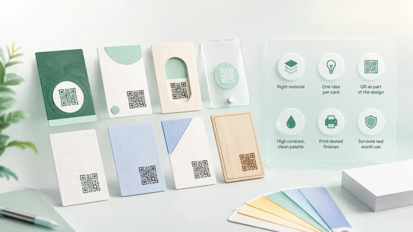
The most reliable visiting card background design pattern is a plain or lightly textured base with one accent element: a colour band along an edge, a faint geometric shape in a corner, or a soft gradient. Keep at least the central third of the card clean for text, and never place fine pattern behind small type. For accent treatments that survive a real print run, see our creative visiting card ideas.
- One background idea, not three — a band, a texture, or a gradient, never all of them.
- Text areas stay plain — pattern belongs at the edges, not behind the name.
- Dark text on light background, or light text on dark — never mid-tone on mid-tone.
- If the card carries a QR code, the code sits on a plain white patch, never on the pattern.
What size and resolution should a visiting card background be?
For print, the background file should be 1050 x 600 pixels at minimum — that is the standard Indian 3.5 x 2 inch card at 300 DPI. With the usual 0.125 inch bleed on each side, export at 1125 x 675 pixels so the press can trim without leaving white slivers at the edges.
Labels like visiting card background hd and visiting card background hd 4k describe screen resolutions, not print quality. Full HD is 1920 x 1080 pixels and 4K is 3840 x 2160 — both comfortably exceed what a card needs, so a full hd visiting card background downloads fine for print as long as you crop it to the card's shape rather than stretching it. The card dimensions themselves, including bleed and safe margins, are covered in our guide to standard visiting card size in India.
The thing that ruins print quality is enlargement. A 500-pixel-wide image stretched to card size prints soft and blotchy no matter what the filename claims. Start from a background visiting card presses can actually work with: a file at least as large as the print size needs, scaled down rather than up.
Which file format is best for a visiting card background?
JPG for photographic or gradient backgrounds, PNG when you need sharp edges or transparency. A visiting card background png keeps flat colours, borders and geometric shapes crisp, and its transparent variant lets you layer a design element over a base colour in Canva or Photoshop without a white box around it.
Whichever format you pick, hand the press the original visiting card background image, not a WhatsApp forward of it. WhatsApp and most chat apps compress images heavily, and that compression shows up as muddy banding across gradients once printed. Email the file or share it via a drive link instead.
What background colour works best for a professional visiting card?
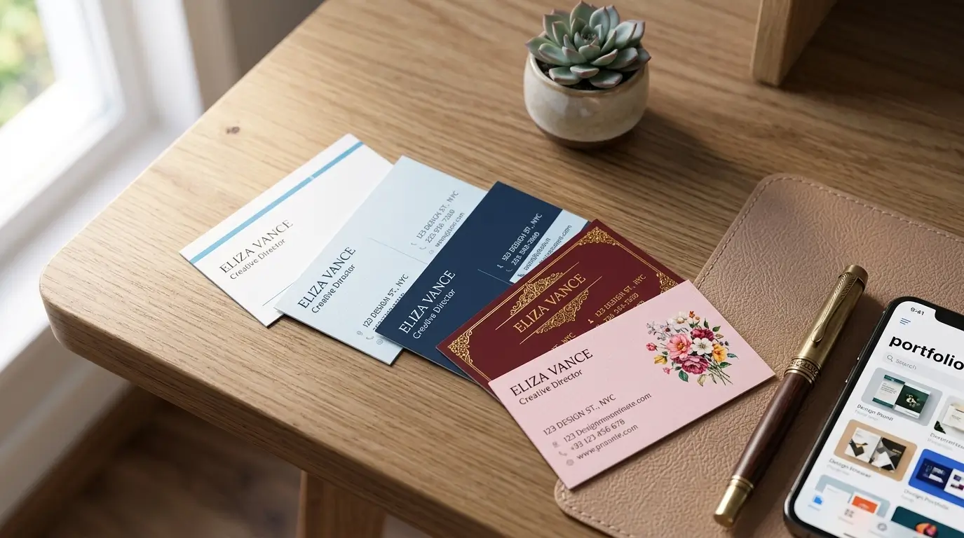
White, off-white and pale grey are the safest choices for a professional visiting card background — they print predictably, keep text legible, and read as confident rather than loud. Deep navy or charcoal with light text is the strongest dark option and suits finance, law and consulting well.
Colour also behaves differently on paper than on screen. Bright saturated backgrounds swallow ink, show fingerprints, and can shift tone between print batches. If you want colour, use it as an accent band on a light base rather than flooding the whole card — you get the personality without the printing risk.
Should different professions use different visiting card backgrounds?
Yes — the background should match what a customer expects from the trade. A Dr visiting card background works best in white or pale blue with a thin accent line: patients read clinical cleanliness as competence. A jewellery visiting card background can go the opposite way, where deep maroon, navy or black with gold accents signals premium. It is one of the few trades where a dark, rich card outperforms a plain white one.
The same logic runs through other trades. Beauty parlours and salons suit soft pastels or elegant florals kept to one corner. Tour and travel operators can use a faint map or horizon image at low opacity. Builders and hardware suppliers do better with strong solids and bold type than with imagery. In every case the rule from the first section still holds: the pattern serves the text, not the other way around. If your trade has its own conventions, it is worth starting from a layout built for it — we have specific guidance for pandits, astrologers, physiotherapists and pest control operators.
Where can I find free visiting card backgrounds?
Canva, Freepik, Vecteezy and Pixabay all offer free visiting card background collections, and Canva's card templates come pre-sized so the bleed maths is done for you. Searching for a blank visiting card background hd file, or a simple visiting card background hd if you want one accent and nothing more, gets you a base design with the text areas left empty, ready for your own details. If you would rather judge finished cards before choosing a base, our guide to visiting card samples explains what to look for.
Check the licence before printing, not after. Free tiers usually allow commercial use but some require attribution, and Freepik's free downloads in particular expect a credit line that makes no sense on a visiting card. A licence-safe download from a smaller library beats a striking design you technically cannot print.
Common visiting card background mistakes
- Stretching a small image to fit — it prints blurry every time.
- Fine pattern behind small text — unreadable at arm's length.
- No bleed — white slivers at the trimmed edges.
- QR code placed on the pattern — scans fail on busy backgrounds.
- Sending the file over WhatsApp — compression wrecks gradients in print.
The background you can change without reprinting
Whatever background you print is fixed the moment the press runs. Change your number, your logo or just your taste, and the whole box of cards is waste paper. That is the hidden cost of getting the visiting card background perfect: perfection lasts exactly one print run — the trade-off is laid out in NFC card vs visiting card.
A free digital visiting card sidesteps that entirely: pick a theme, swap the colours whenever you like, and share it by link or QR — the design updates for everyone instantly, and there is nothing to reprint. Many people run both: a clean printed card with a simple background, and a digital profile behind its QR code carrying everything else.