
The best creative visiting card ideas are the ones that still work at 89 x 51 mm. Plenty look striking on a designer's screen and fall apart at the press — fine patterns that turn to mud, text that gets trimmed off, foil that costs more than the order. The ideas below survive contact with a real print run.
If you are collecting visiting card design ideas before briefing a designer, sort them by whether they change the material, the layout or the function. Those three levers behave very differently in cost and in effect, and most unique visiting card ideas come down to them.
Material is the idea most people skip
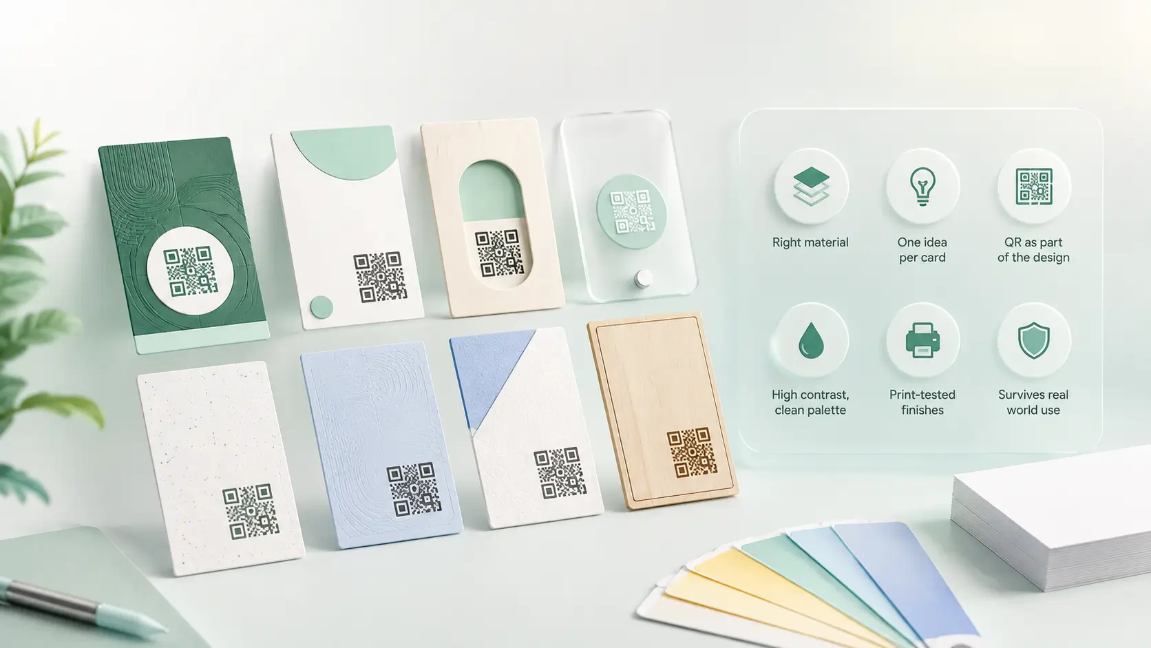
Before touching the layout, consider what the card is made of. A wooden card is noticed by hand before it is read by eye, and no amount of layout work buys that. Metal does the same at a higher price point. PVC survives a wallet where 300 GSM paper softens. Material is the one idea a competitor cannot copy from a photograph.
Layout ideas that hold up in print
- One idea per card. A colour band, a texture, or a shape — not all three. Restraint is what reads as expensive.
- Use the back. Most cards waste an entire side. Put the QR, a service list or a single line of positioning there rather than cramming the front.
- Vertical orientation stands out in a stack — but it does not sit flat in most card holders, so weigh the trade.
- Oversized type for the name alone. It reads across a table and costs nothing extra.
Treat the QR as design, not an afterthought
A QR pasted into a corner at the last minute looks exactly like what it is. Designed in from the start — given its own quiet zone, sized 15–20 mm, paired with a two-word instruction — it becomes a feature rather than a blemish. It also changes what the card can hold: the printed side stays minimal because everything else lives behind the scan. Sizing rules are in the QR code size guide.
Ideas that look good and print badly
- Hairline type under 6pt — legible on screen, invisible in hand.
- Fine repeating pattern behind text — the pattern wins and the phone number loses.
- Full-bleed dark colour — heavy ink, visible fingerprints, tone shifts between batches.
- Die-cut shapes — memorable, but they jam in wallets and cost several times a standard cut.
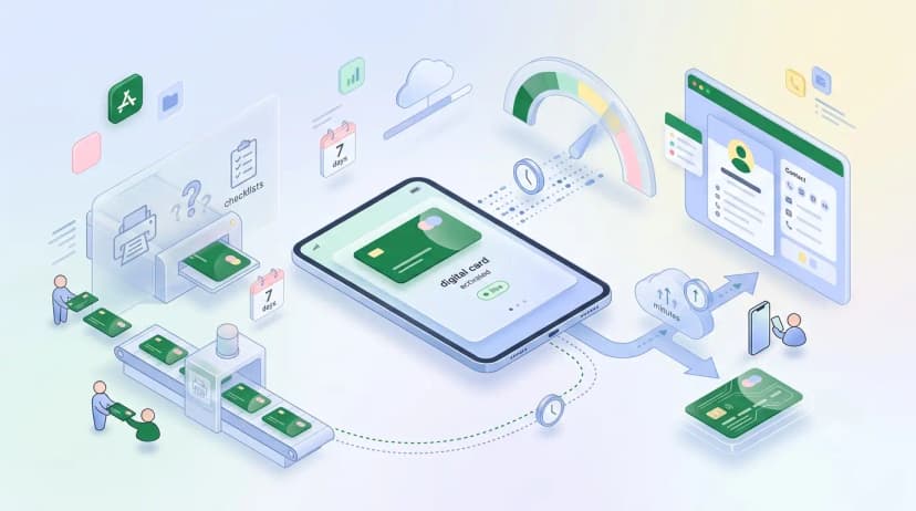
Whichever direction you take, the layout is fixed the day it prints. The one idea that keeps working is putting a link on the card rather than the details themselves — change the profile, and every card already handed out points somewhere current. That is what an NFC card does with the tap instead of the scan.