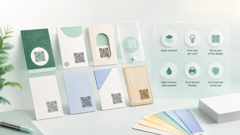
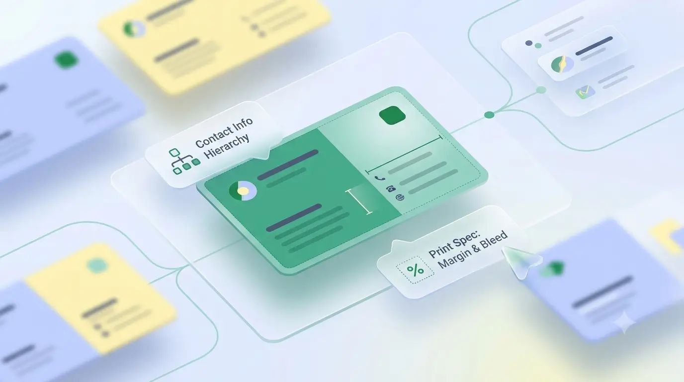

A good sample for visiting card design is worth studying for its structure, not for copying. What separates one that works from one that just looks busy is hierarchy — your name reading first, your number reading second, and everything else knowing its place. Look at that before you look at the colours.
Most people browsing a visiting card sample are about to get cards printed and want reassurance. Here is what to actually take from one, trade by trade, plus the print specs any sample has to respect before it reaches a press.
What a good visiting card sample shows you
- One clear hierarchy. Name largest, role or business next, contact smallest but still readable at arm's length. If three things compete for attention, none of them wins.
- Restraint on contact details. One number people actually answer beats three they have to choose between.
- Whitespace that is deliberate. The empty area is what makes the printed area readable.
- A QR with room to breathe. If a sample crowds the code against an edge, that card will fail at the counter.
Visiting card samples by trade
The same layout does not suit every business. A doctor's card leans clinical — white or pale blue, qualification beside the name, consulting hours where a patient will look. A jeweller can go the other way, because a dark card with gold accents signals the price bracket before a word is read. A contractor's card earns its place by listing the trades taken, since the person reading it is deciding whether to call at all. A salon lives on softer colour and one photograph rather than a list.
The specs every sample has to respect
A sample that ignores print reality is decoration. The Indian standard is 89 x 51 mm with 3 mm bleed on every side, artwork at 300 DPI in CMYK, and all text kept 3–5 mm inside the trim line because a guillotine drifts on a real production run. Our visiting card size guide has the full chart in mm, inches and pixels, and the visiting card background guide covers what fills that canvas without swallowing the text.
The problem with any printed sample
Every visiting card example you admire has one flaw built in: it is fixed the moment it is printed. Change your number, move premises, add a service, and the whole box is waste. That is not an argument against printing — a good card at 400 GSM still makes an impression a tap does not. It is an argument for putting a QR on it that opens something you can edit.
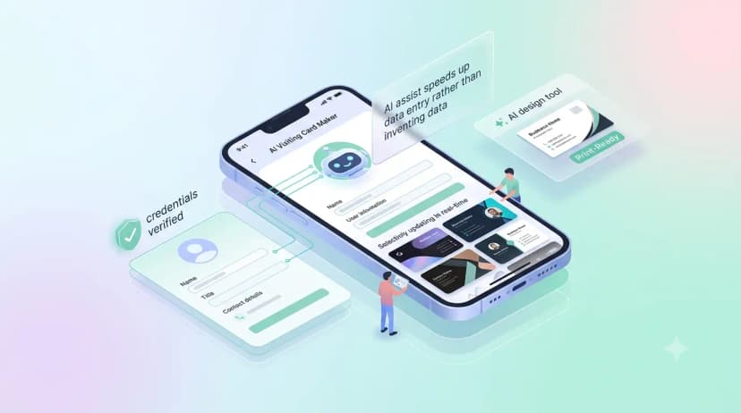
You can build that profile free in a few minutes and use its link as the QR target, whether or not you order a physical card from us. If you do order one, our design team sets the artwork up with your name, logo and branding before printing — that comes with the card. We do not hand out downloadable templates, because a card only works once its chip and QR are linked to your own profile.