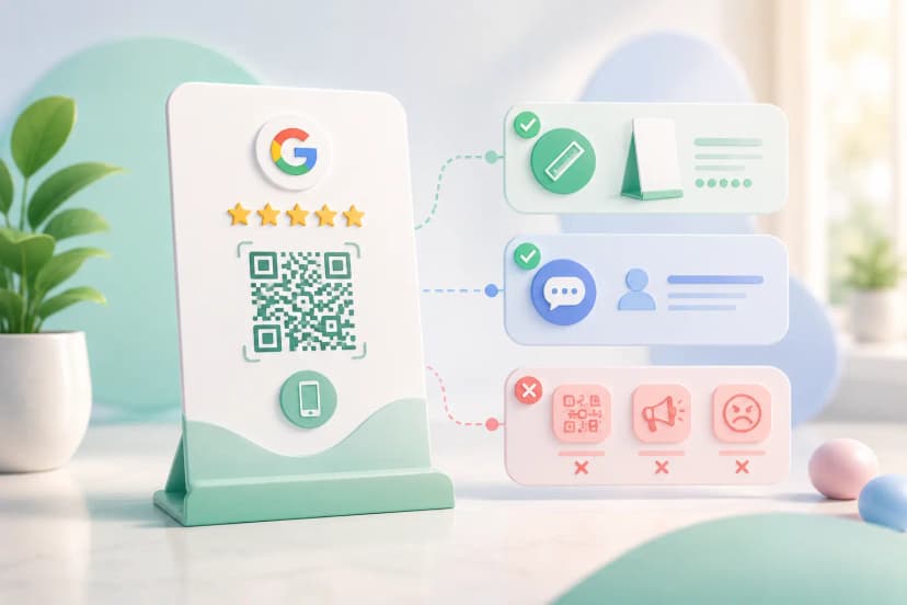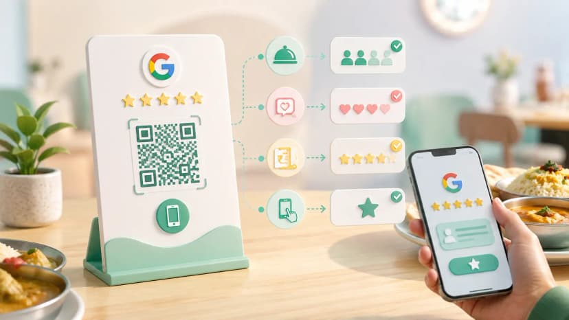


A Google review QR code poster works when three things are right: the code is big enough for the distance people stand at, it sits where customers already pause, and it says in plain words what tapping it does. Most posters fail on the second and third, not the first — the code scans fine, nobody looks at it.
This assumes you already have your review link. If not, start with setting up the review QR code and come back — this page is about the physical asset that goes on your counter.
Where can I get a free Google review QR code poster?
Google gives you one. Inside your Business Profile there is a marketing-materials section that produces a printable sheet with your review code already embedded — no third-party tool, no cost. Beyond that, building a Google review QR code poster template yourself takes ten minutes: drop in the code image, add one instruction line, print on A5. A Google review QR code template free of charge is easy to find; what varies is whether it survives a counter. Your Google review link is the input for all of these.
The catch with paper: a printed sheet on an Indian shop counter lasts about three weeks before it is curled, tea-stained or buried under a bill book. Free is the right place to start, but plan for what replaces it.
What size should a Google review QR code poster be?
Size the code to the distance, not the paper. The 10:1 rule applies: divide the scanning distance by ten for the minimum code width. At a billing counter people stand about 30–40 cm away, so a 30–40 mm code is the floor and 50 mm is comfortable. A wall poster read from two metres needs a 200 mm code — far bigger than most people expect, which is why wall posters get ignored. The QR code size guide has the full distance table.
Leave a clear white margin of roughly four modules around the code. A Google review QR code design that boxes the code in with a border or crowds it with text is the most common reason a scan hesitates. Any Google review QR code design template you start from is worth checking for that before it goes to print. The same rules decide what makes a review card actually get used.
- Print matte, never gloss. Overhead tube lights and phone torches bounce off a glossy laminate straight into the camera.
- Keep the code near-black on white. Mid-tone brand colours look fine on screen and fail under a shop's yellow lighting.
Where should I place a review QR poster in my shop?
At the point where the customer is already waiting with their phone out — the billing counter, next to the payment QR. That moment is the whole game: they are stationary, holding the phone, and the transaction just went well. An entrance poster catches people arriving, when they have nothing to review yet, and a poster behind the counter faces the staff rather than the customer. In a restaurant the timing is different again — how restaurants increase Google reviews covers the table-side moment.
- Billing counter — best position in almost every shop. Angle it toward the customer, not flat on the surface where it reflects the ceiling light.
- Table tent — for cafes and restaurants, where the wait happens at the table rather than the till.
- Salon or clinic — at the mirror or the waiting bench, where people sit idle for several minutes.
- A Google review QR code sticker on the counter edge or the door glass works as a second touchpoint. On its own a sticker rarely performs; paired with a standing asset it does.
Should I use a printed poster or a standee for Google reviews?
Start with a poster, move to a standee once you know it works. A poster costs nothing and tells you within a fortnight whether the position is right. A google review standee earns its place after that — it stands upright at the correct angle, does not curl, survives being wiped down, and does not get shuffled under paperwork. The practical difference is not scan rate on day one; it is whether the thing still exists on day sixty.
You can improvise the whole thing: a printed sheet in a cheap acrylic menu holder is a Google review QR code stand free of cost, and it does most of the job. A purpose-made Google review QR code standee or a Google review QR code frame buys you durability, and the NFC-equipped versions let customers tap rather than open the camera and aim.
What should the poster say next to the QR code?
One short instruction and nothing else. "Scan to review us on Google" outperforms a bare code and outperforms a paragraph. People need to know what opens before they point a camera at an unknown square, and they will not read more than about six words while a bill is being handed over.
Add your shop name so the poster is unmistakably yours. Add the Google logo mark only in the form Google permits in its brand guidelines. Skip everything else — no star graphics implying a rating you have not earned, no promise of a discount for reviewing. Offering anything in exchange for a review breaches Google's policies and can get your reviews stripped, which costs far more than it gains.
A bilingual line helps in most Indian markets — English plus the local language, one line each. Two languages, not four.
Can I put my logo on a Google review QR poster?
Yes on the poster, cautiously inside the code. Your logo anywhere on the surrounding design is fine and helps people recognise the business. Placing it in the centre of the code itself works only if error correction is at level Q or H and the logo covers under roughly a quarter of the code area — otherwise you are trading scan reliability for branding, which is a bad trade on an asset whose only job is to be scanned.
Test before you print fifty
Print one, put it in position, and scan it from where a customer actually stands — not leaning over it. Use an older Android as well as a newer phone, and do it with the shop's normal lighting on rather than by the window. Check that the link lands on the review box directly and does not stop at your business listing, because an extra tap loses a meaningful share of people. If all that holds, print the batch. If you are fitting out several outlets, ordering review cards in bulk keeps every counter identical without repeating the print run branch by branch.
The poster is the easy part. Getting staff to point at it at the right moment is what actually moves the number — more on that in the guide to getting more Google reviews, and you can order a ready-made review QR setup if you would rather skip the printing entirely.