
Most Google review card design advice starts with the artwork. At a counter, the artwork is almost never what went wrong. Cards get ignored because they are too small to scan comfortably, because they say nothing about what tapping them does, or because they sit somewhere nobody looks. The design still has a job, which is to look like it belongs to your business rather than to a supplier. Here is what actually matters, in order.
Key takeaways
- A four-word instruction line does more than any artwork: "Tap to review us" or "Scan to rate us".
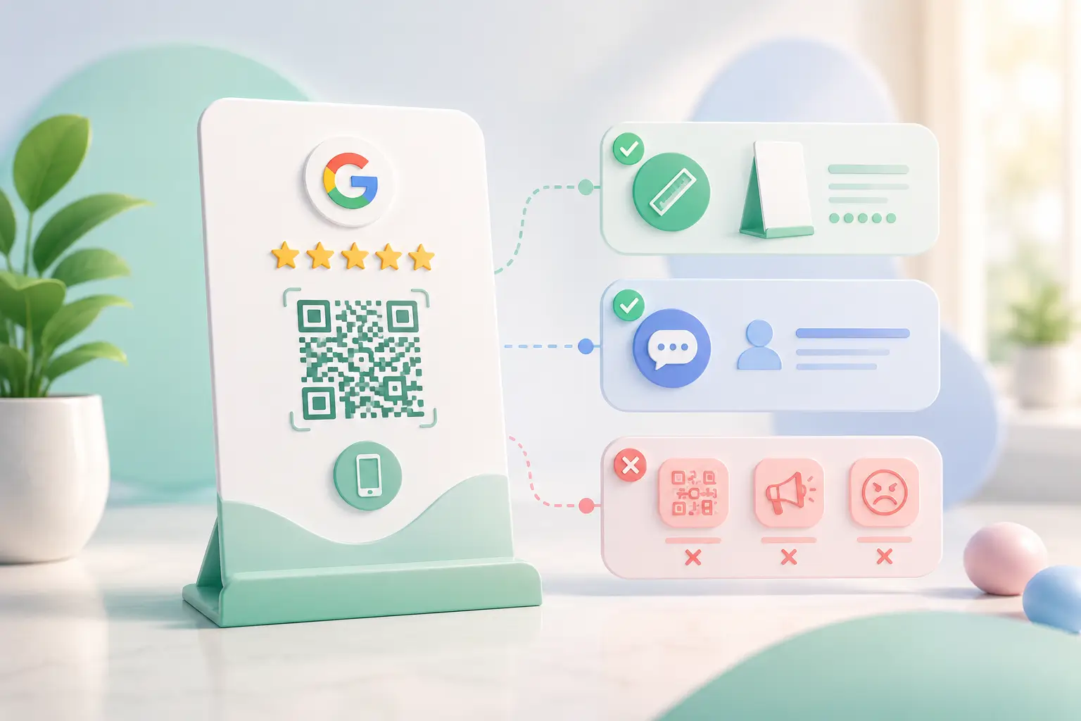
- QR at least 2 cm square, dark on light, with a clear margin; place it where the customer already pauses.
- There is no downloadable Google review card template, by design; the card only works once its chip and QR point at your own review page, so the artwork is set up for you with the card.
Why does the instruction line do most of the work?
Four words beat a clever tagline. "Tap to review us" or "Scan to rate us" tells the customer what will happen before they commit, and people are far more willing to tap something when they know where it leads. On an NFC Google review card the tap and the scan do the same job, so one instruction line covers both. A card with a code and no instruction gets ignored, however good it looks.
What size and contrast does the code need?
Print the QR at least 2 cm square with a clear blank margin on all four sides, dark on light. Low-contrast pastel codes and inverted light-on-dark ones scan unreliably in the dim indoor light of a real shop. The QR size guide covers the distance maths if your card sits further from the customer.
Design for where it will sit
| Format | Read from | Design priority | Where it fails |
|---|---|---|---|
| Flat card beside the card machine | Above, at arm's length | Instruction line and QR size | Gets buried under receipts on a busy counter |
| Standee on the counter | Front, at about a metre | Larger QR, bold instruction, stays upright | Needs counter space; a quiet counter does not need it |
| Card handed over with the bill | In hand | Branding so it is kept, not binned | Only works if staff remember to hand it over |
If your card keeps getting buried under receipts, the format is wrong rather than the design; a standee stays upright and visible where a flat card does not. The same rules carry over to a Google review standee design; only the viewing distance changes.
What gets it used
- A four-word instruction above the code
- A dark code on a plain light patch, 2 cm or larger
- Your business name and logo so it reads as yours
- Placement beside the card machine or where change is counted
What gets a review card ignored
- A clever tagline instead of an instruction
- A QR under 1.5 cm or printed on a pattern
- Light-on-dark or pastel codes
- A card placed where nobody stops
Can I get a template?
Why there is no downloadable template
- A review card only works once its chip and QR are linked to your own Google review page, so a blank template would be a picture rather than a working card.
- What you do get is the design done for you: our team sets the card up with your business name, logo and branding before printing, and that comes with the card itself.
Compare formats on the review card comparison, or see how the Google review QR code itself gets encoded before anything is printed.
.webp&w=828&q=75 "Best AI Tools for Small Business in India (2026)")